May 16, 2024
Data Visualization Basics for Election Administrators
What is data visualization?
Data visualization is the process of using graphic elements like charts, graphs or maps to represent data. It takes complex information, such as voter turnout numbers or registration activity, and translates it into a visual that’s easier to follow and understand. Data visualization helps us to quickly spot trends and patterns.
Infographics and online dashboards can help election administrators explain large numbers, complicated processes and complex topics.
Infographics
An infographic uses graphics to convey information. It’s a collection of images; data visualizations, such as pie charts, maps and bar graphs; and minimal text that communicates large amounts or complex information quickly and clearly.
Infographics work best for information that is static, and you can use them on your website, on social media and in print. They can help with storytelling, summarizing reports and presenting data in an engaging and attractive way. Infographics work well to explain election processes, such as registering to vote or requesting a mail ballot.
Examples:
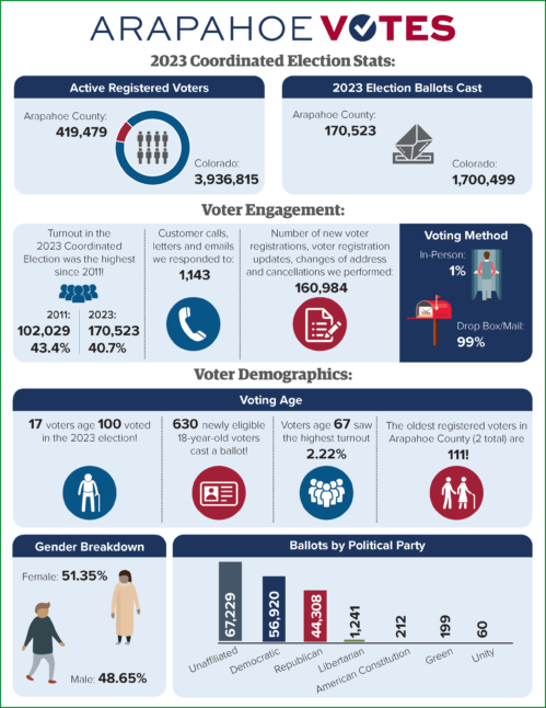
- Year-end election statistics for 2023
Arapahoe County, Colorado
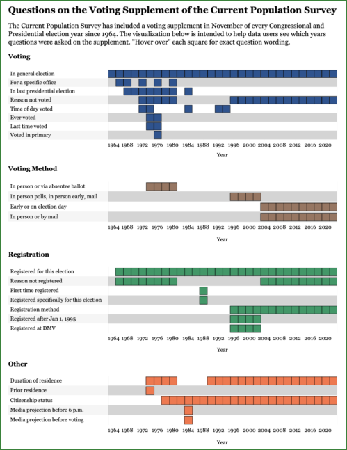
- Voting and registration data visualizations
U.S. Census Bureau
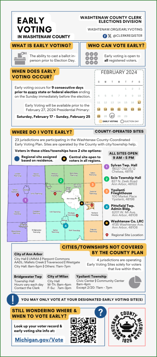
- Early voting
Washtenaw County, Michigan
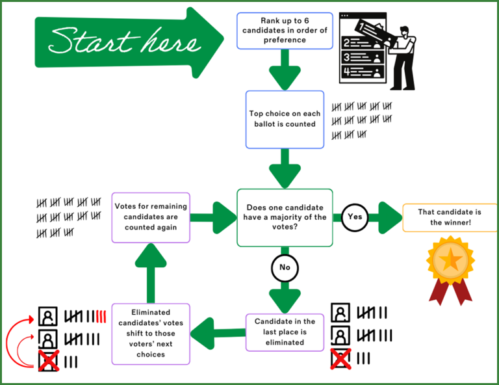
- Single-winner ranked choice voting
Portland, Maine
Dashboards
Online dashboards display active data using visuals, such as charts and maps. They work like infographics for information that is not static. By showing ups and downs in real time or with regular updates, these visualizations can help identify trends and patterns and present users with snapshots of information at a given time. Dashboards are also interactive, allowing the user to easily change parameters for more specific, filtered views. Dashboards typically focus on the accurate and clear presentation of measurable data.
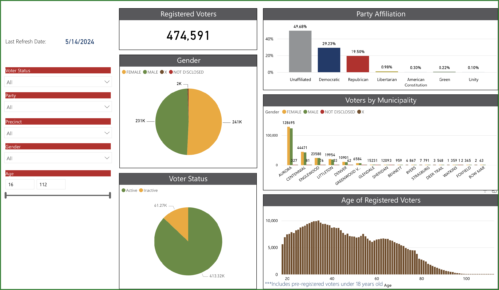
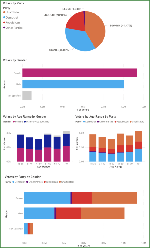
Election offices are using dashboards to show current voter registration information by location, age, political party and other factors. They’re also using it to show how voter registration lists grow and shrink almost daily, with new registrations, changes of address and death notifications.
Examples:
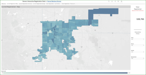
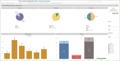
- Current voter registration map and current voter registration overview
Denver, Colorado
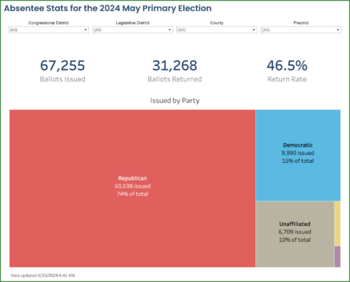
- Weekly voter registration statistics
Arapahoe County, Colo.
- State and local voter demographics
Greenwich, Connecticut
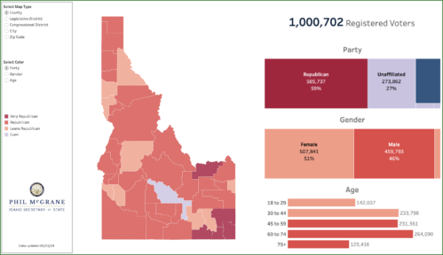
- Data and dashboards
VoteIdaho
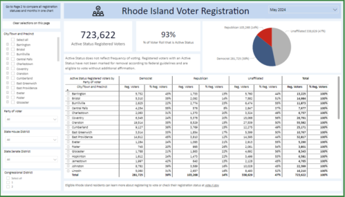
- Voter registration
Rhode Island
Why should you use data visualization?
- Transparency: Data visualization helps more people access data that might otherwise be buried in a text file, report or spreadsheet or available by request. By putting data out there and making it easy to follow, the public can better understand and interact with it.
- Understanding: Dashboards can present different, but related data sets on the same page. Connecting relevant information can help election officials tell a story or make a point. And making a set of data visualizations viewable at a glance can make individual visualizations easier to follow.
- Awareness: It can be tough to explain some election-related topics in a way the public can not only understand but appreciate. Data visualization can help.
- Accuracy: Election office dashboards display data visualizations generated using official data sources, such as the state’s voter registration database. Election officials use standardized or automated processes to review and regularly update data. They also include information on when the dashboard was last updated to avoid misinterpretation.
How do I get started?
- Infographics: If you have data to communicate to the public and visuals could help make it easier to understand, there are a number of resources available.
- Web applications like Canva and Piktochart have infographic templates you can use and modify. There are free and paid options available.
- If you’re handy with layout and design, you can create charts in Microsoft Excel or Google Sheets and incorporate them into a custom infographic.
- A graphic designer can create images, format your content and design an engaging and effective infographic for you.
- The Elections Group’s Communications Resource Desk team is also available to help with templates or custom infographics.
- Dashboards: Some election offices build their own dashboards, while others seek outside development help.
- Offices taking the DIY approach to building a dashboard use data visualization applications, such as Tableau and Power BI. These programs may involve additional costs and training but produce a more professional dashboard that can be integrated with your website.
- Other offices seek help from organizations and businesses with experience developing dashboards and using data visualization to communicate information that is live or updated regularly.
- U.S. Digital Response supports state and local governments with technical expertise and tools. Their staff members and volunteers provide guidance and skilled assistance to help teams overcome challenges such as communicating updated voter registration statistics during busy election cycles.
- Data analysis is another way to boost public confidence in election data. Groups such as VoteShield analyze publicly available voter databases and mail ballot processing files to identify unexpected or improper changes that could affect the administration of, or confidence in, an election.
- If you’re interested in developing a dashboard but have questions, connect with The Elections Group, so we can help you get started.